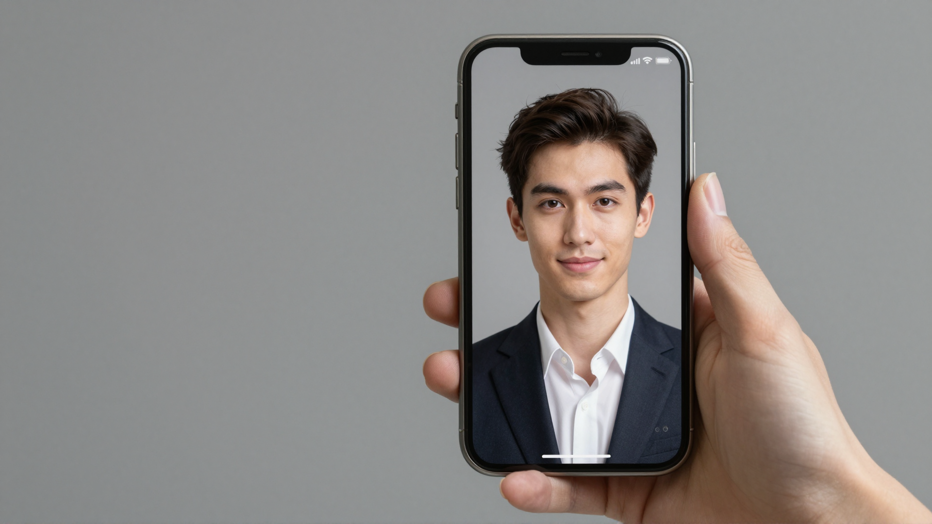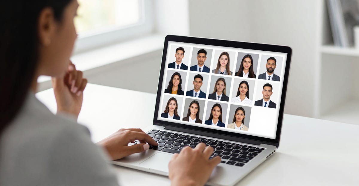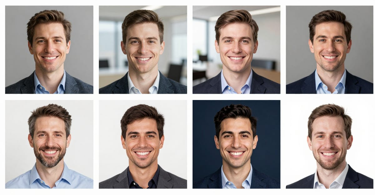
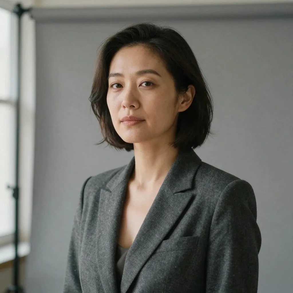
The safest professional headshot background is a solid neutral gray or a soft blurred office — both read as polished and work everywhere from LinkedIn to a corporate directory. Deep navy signals authority for executives, clean white suits actors and creatives, and anything busy or brightly colored works against you. You don't need a photo studio to get any of them: an AI headshot tool lets you pick a style — each with an appropriate professional background — and generate a fresh studio portrait from a single selfie in a couple of minutes.
This guide breaks down which background to use for which purpose, the color psychology behind each, and how to get a clean professional background without re-shooting.
Quick answer: The best professional headshot background is a solid, softly blurred neutral tone (gray, blue, or white) that keeps the focus on your face; with Imagera you can swap any background in under a minute without a reshoot.
Which background color works best for a professional headshot in 2026?
For most corporate uses, stick to three neutrals: light gray, soft blue, or clean white. Light gray suits LinkedIn and 4K resume photos; blue reads trustworthy for finance and law; white fits e-commerce and press kits. Imagera renders all three in one batch at up to 8K, so you can compare options in seconds.
Can I change a headshot background without retaking the photo?
Yes. Imagera isolates your subject and replaces the backdrop in under a minute, outputting 4K or 8K files from a single upload, and you can generate five or more variations from one photo. A clean, distraction-free background makes a headshot look more approachable and professional, so testing two or three neutral options before you publish is worth the extra minute.
Why the background matters more than you think
Look at a headshot at the size it's actually seen — a LinkedIn thumbnail, a Slack avatar, a directory tile. The background fills most of the frame. Before anyone processes your face, they've absorbed the color and mood behind it.
A messy home background reads as "didn't try." A neon-bright color reads as "distracting." A clean, intentional background reads as "professional" before a single word is exchanged. It's low-effort signaling that punches above its weight.
The good news: there are only a handful of choices that genuinely work, so this is an easy decision to get right. The background is also the single element most people get wrong, precisely because they focus on the face and forget that the frame is mostly wall. Fix the background and you've fixed the majority of what a viewer actually sees.
There's a second reason background matters more than the face at small sizes: compression and cropping. Platforms downscale your photo hard, and a busy background turns into visual noise the moment it's shrunk to 100 pixels. A clean, low-contrast backdrop survives that treatment intact — your face stays the brightest, sharpest thing in the frame no matter how small the thumbnail gets.
The professional background decision table
Here's a practical map from your goal to the background that fits it.

| Use case | Best background | Why | Avoid |
|---|---|---|---|
| LinkedIn / general professional | Neutral gray or soft office blur | Universal, recruiter-safe, timeless | Home clutter, bright colors |
| Corporate directory / team page | Solid neutral gray (single company color) | Consistency across the whole team | Everyone picking different backgrounds |
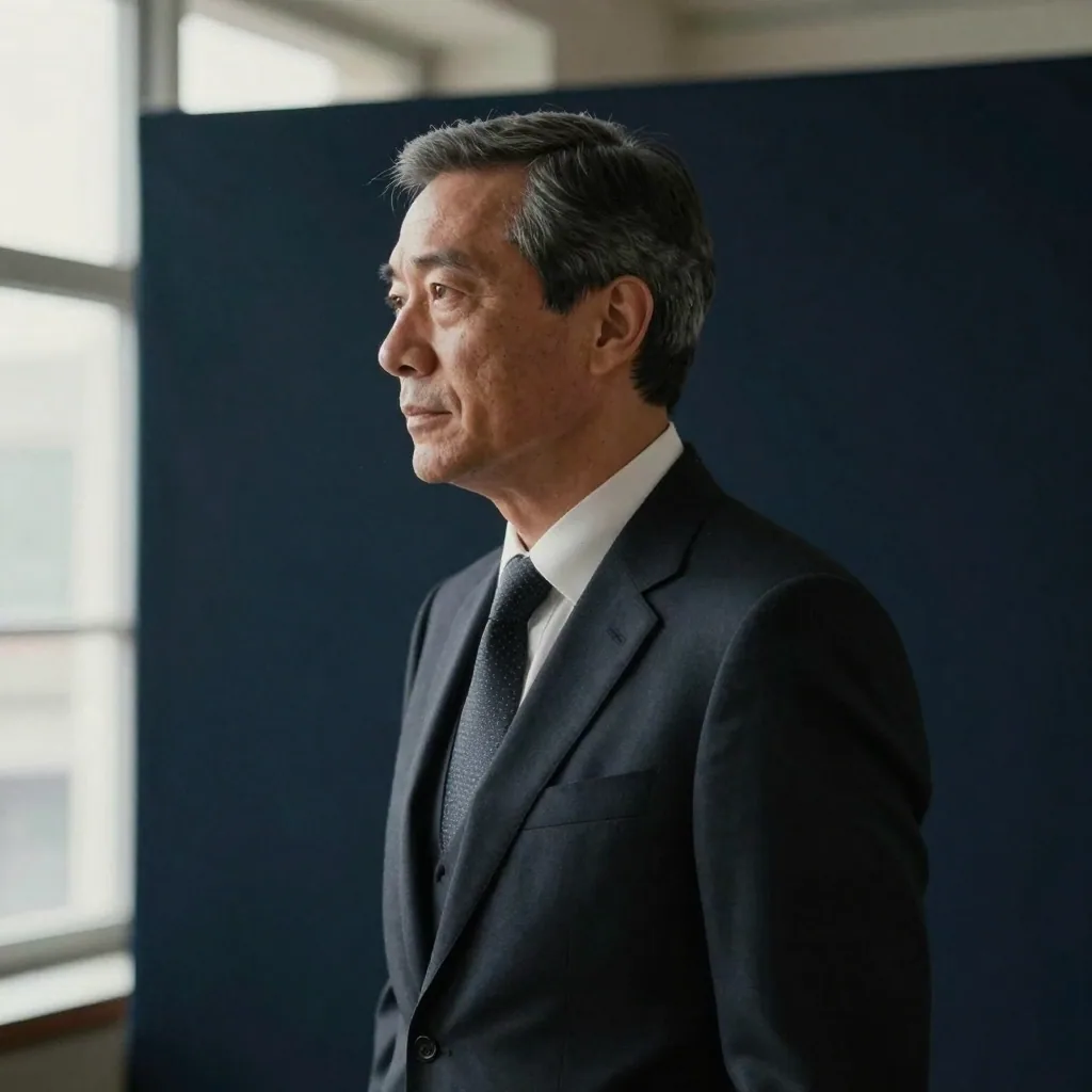
| Executive / leadership | Deep navy or charcoal | Authority, gravitas, contrast | White (can look too casual) |
| Actor / performer headshot | Clean, evenly lit background per casting brief | Casting directors want the face, no distraction | Trendy colors, props |
| Creative / personal brand | Soft brand-color or on-brand office | Personality without chaos | Loud gradients, busy patterns |
| Medical / legal / finance | Neutral gray or navy | Trust, seriousness | Casual outdoor, playful tones |
Two rules cut through all of it: when in doubt, neutral gray, and for a team, everyone uses the same one.
What "professional background" actually means
It helps to define the target before chasing it. A professional headshot background isn't a specific color — it's a set of qualities that hold across every good example:
- Even, and out of focus. It should sit softly behind you with no sharp edges or objects fighting for attention. If a viewer's eye lands anywhere but your face, the background has failed.
- Low contrast with your face. The backdrop should be quieter than you are. That usually means a mid-tone that separates cleanly from your hair and shoulders without being distractingly dark or blindingly light.
- Free of story. A doorway, a bookshelf, a window with a view — each invites the viewer to read the scene instead of you. A professional background is deliberately boring.
- Consistent lighting. No hotspots, no hard shadow cast onto the wall behind your head. Flat, even light on the backdrop reads as "shot in a studio," which is the whole point.
Every recommendation in this guide — gray, navy, white, blurred office — is just a specific way of hitting those four qualities. Keep them in mind and you can judge any background on its own merits, including the ones a tool generates for you.
Background color psychology (quick reference)
Color choice isn't just taste — each reads differently:

- Neutral gray — the default professional. Flattering on every skin tone and outfit color, never dates, never distracts. If you only pick one, pick this.
- Soft office blur — approachable and modern. Suggests "I work somewhere real" without showing clutter. Great for LinkedIn where warmth helps.
- Deep navy / charcoal — authority and depth. The go-to for executives, finance, and legal. Adds contrast that makes lighter hair and skin pop.
- Clean white — crisp and neutral in a different way. Standard for actor and modeling headshots and some minimalist brands, but can feel clinical for a warm personal profile.
- Brand color — use only if your brand is strong and you keep it muted. A subtle brand-tinted background can reinforce identity; a saturated one competes with your face.
What to avoid across the board: cluttered rooms, harsh outdoor sun, neon or highly saturated colors, and busy patterns. They pull attention off your face, which is the one thing the photo exists to show.
One nuance worth knowing: a subtle gradient now reads as more current than a perfectly flat solid on corporate profiles — a gray that shifts gently from a touch lighter behind your head to a touch darker at the edges looks intentional and modern rather than cut-out. It's the same neutral-gray principle, just with a little dimension.
LinkedIn vs. corporate vs. actor: the key differences
The "right" background genuinely changes by context.
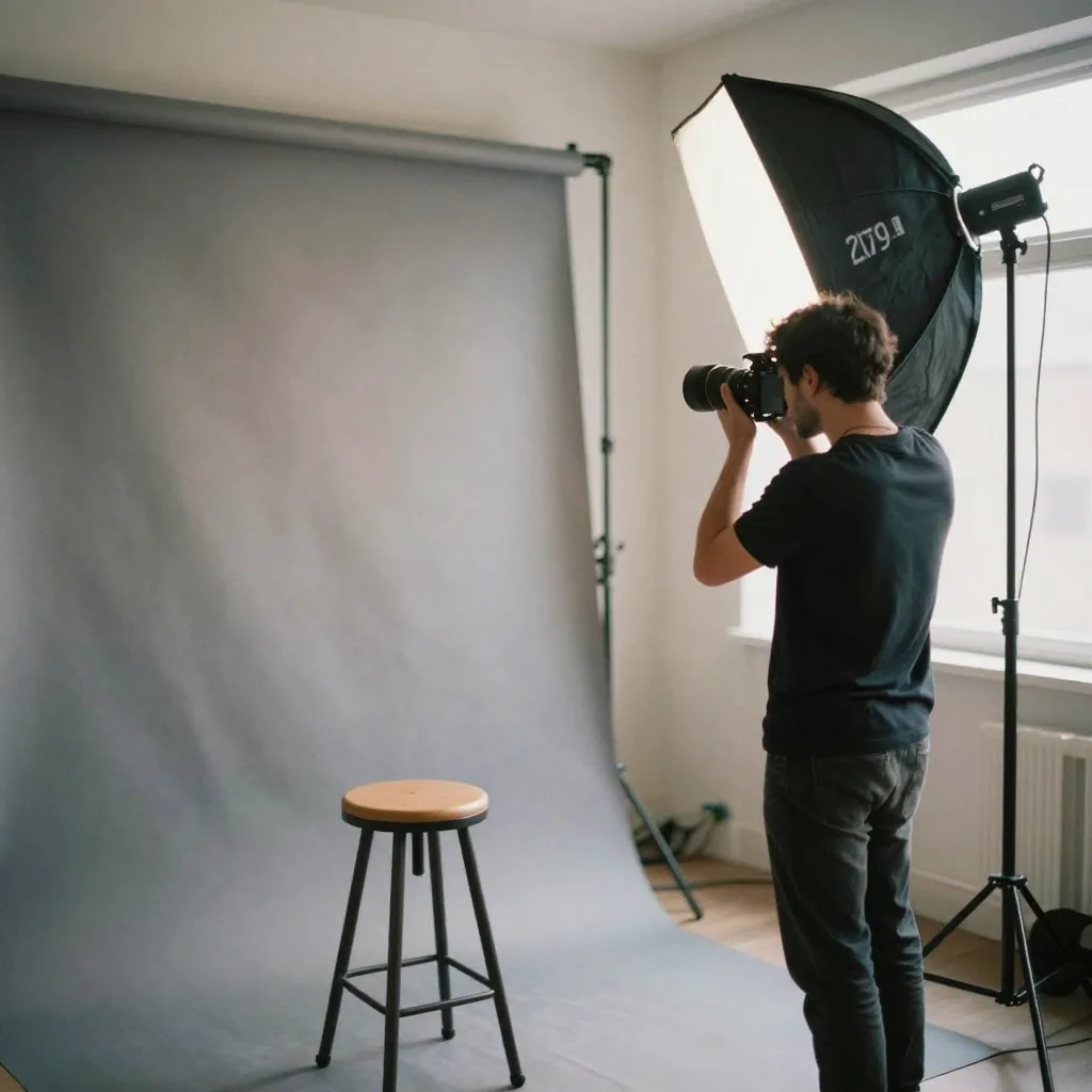
LinkedIn / job search. Recruiters skim dozens of profiles. You want to look approachable and competent, not staged. Neutral gray or a soft office blur is ideal — warm enough to seem human, clean enough to seem professional. LinkedIn also crops your photo into a circle, so keep the background simple right out to the corners; a busy edge only gets messier once it's masked into a circle.
Corporate / company directory. Here the priority flips from individual expression to team consistency. The best-looking directories use one shared background for everyone. If you're setting the standard for a team, see our guide to consistent team headshots — the background is the first thing to lock.
Actor / performer. Casting has its own conventions. Backgrounds are typically clean and evenly lit so nothing competes with the face and expression, and light gray or white are common choices. When a casting call gives specific requirements, follow that brief over any general advice.
Medical, legal and finance. These are trust-first fields, and the background should say "serious and steady" without saying "cold." Neutral gray or deep navy both work; navy adds a little extra gravitas that suits senior or client-facing roles. Keep attire and background quiet so your expression carries the credibility.
How it works: turning a selfie into a clean-background portrait
You don't need to re-shoot to fix a bad background. And you don't have to manually cut yourself out and paste a new backdrop behind you, which almost always leaves telltale halos around hair. Instead, Imagera's AI Headshot tool generates a fresh studio portrait built from your own photos, with a professional background and studio lighting baked in from the start.

Here's what's actually happening under the hood, so you know what to expect:
- You upload up to four selfies. The tool reads your face across all of them — not one flattering angle, but the consistent features that make you you.
- It preserves your likeness. Rather than inventing a new face or heavily stylizing yours, Imagera keeps your real facial identity and only refines the lighting, framing, wardrobe and background. The point is that the result still looks like you, not a lookalike.
- It renders the whole scene together. Because the background and lighting are generated as part of the same portrait rather than pasted on afterward, edges — including hair — sit naturally against the backdrop. There's no cut-out seam to give it away.
- It applies the style you chose. Each preset — LinkedIn, corporate, real-estate, creative/actor — comes with an appropriate background and lighting profile, so the backdrop matches the intent of the shot.
The result lands in your history at high resolution, ready to download and crop for wherever it's going.
Step-by-step: get a clean headshot background from one selfie
1. Start with a usable source photo
- Face an even light source (a window works well).
- Neutral expression or a natural smile, looking at the camera.
- Your everyday background is fine — the tool generates a new studio portrait, so it won't carry over.
- Avoid heavy filters, sunglasses, and hats.
- If you can, upload two to four photos from slightly different angles. More variety gives a stronger, more faithful likeness than a single shot.
2. Pick a style and generate
Open Imagera's AI Headshot studio, upload your selfie, and choose the style that fits your use case — each style (corporate, business casual, LinkedIn, creative/actor, real estate) comes with its own appropriate professional background and lighting. Pick your quality tier and resolution, then generate. The tool produces a fresh studio portrait with that background and lighting built in, while preserving your actual likeness rather than generating a stranger's face.
3. Try a couple of styles, then pick
Generation is quick, so try a couple of styles and compare the results at thumbnail size — the size people actually see them. A neutral corporate look is the safe pick, but you may find a different style reads better for your context. Each generation is a fresh portrait, so pick the one that looks best small.
4. Match the crop to the platform
LinkedIn is a circle crop, so keep your head centered with breathing room. Directories and actor headshots often want a specific aspect ratio. Because Imagera exports at high resolution, you have room to crop to your platform's exact ratio without softening the image. Export a version that fits where it's going.
Who it's for and common use cases
The right background depends heavily on who you are and where the photo lives. A few concrete scenarios:
- The job seeker. You're applying across LinkedIn, company career portals, and maybe a CV. A neutral gray or soft blurred-office background works everywhere, so you carry one credible photo across every touchpoint a recruiter checks.
- The new manager updating a stale photo. Your old headshot is three roles out of date. A charcoal or navy background reads a notch more senior than a bright white one, matching the level you're operating at now.
- The real-estate agent. You need a bright, trustworthy photo for listings, signage and your brokerage page. A clean, warm, evenly lit backdrop keeps you approachable while staying professional — and you can regenerate seasonal variations without re-booking a shoot.
- The team lead standardizing a directory. Twenty people, twenty different home backgrounds. Everyone uploads their own selfies and picks the same style, and the directory suddenly looks like it was shot in one session. This is where a shared solid-gray background does the most work.
- The actor building a casting profile. Casting wants your face and nothing else. A clean, evenly lit gray or white background per the casting brief keeps expression front and center.
- The consultant or founder building a personal brand. A muted, on-brand background — a soft version of your brand color or an on-brand office blur — adds a hint of identity without competing with your face.
Comparison: your options for fixing a headshot background
There's more than one way to get a clean backdrop. Here's an honest look at the trade-offs. Competitor prices are typical market rates; the Imagera column is expressed in credits, since a single upload can produce several looks.
| Approach | Turnaround | Background quality | Typical cost |
|---|---|---|---|
| Studio photographer | Days to book, then wait for edits | Excellent, but locked to one sitting | Roughly $150–$500 per US session, plus reshoots |
| Manual background removal / swap | Minutes to hours of fiddly editing | Hair edges and halos often give it away | Free to a monthly editor subscription |
| Generic AI image generator | Minutes | Can drift away from your real face | Varies; often a monthly plan |
| Imagera AI Headshot | Minutes | Studio background rendered with your face, likeness preserved | Runs on Imagera credits; one upload yields several looks |
The key distinction: manual removal and generic AI tools operate on a photo, so they either leave cut-out seams or re-render your face into someone slightly different. Imagera generates a fresh portrait built from your own photos with the background baked in, so edges look natural and the result still recognizably you.
Tips for best results
- Upload more than one selfie. One to four photos are supported. Two to four, from slightly different angles and lighting, noticeably improve the likeness — the tool has more of your real face to work from.
- Pick the background for the platform, not for novelty. Neutral gray for LinkedIn and general use; navy or charcoal to signal seniority; clean white or light gray for casting. Save the fun colors for a personal project, not your professional profile.
- Keep your source clothing neat. Imagera applies clean business attire to the styles, but starting from uncluttered, solid-colored clothing in your uploads gives the truest result.
- Judge the result at thumbnail size. Shrink it to the size it'll actually appear. A background that looks fine at full size can turn muddy when compressed to a small avatar.
- Match the crop before you publish. LinkedIn crops to a circle; directories and casting sites want specific ratios. Export from the high-resolution file so you have room to crop cleanly.
- For a team, lock the style first. Decide on one background and share it before anyone generates, so the whole set matches from the start.
Common mistakes to avoid
- Chasing a trendy color. A bright hue that feels fresh this year looks dated next year. Neutral gray and navy don't have that problem — that's a big part of why they're the standard.
- Letting the background out-brighten your face. A backdrop lighter or more saturated than you are drags the eye off your face. The background should always be the quieter element.
- Mixing backgrounds across a team. Nothing undermines a directory faster than six people on gray, four on white, and two in their kitchens. Consistency reads as competence.
- Keeping a busy real background "because it shows my office." At thumbnail size, that office is noise. If you want to signal a workplace, a blurred office reads as "I work somewhere real" without the clutter.
- Publishing without reviewing hair edges. The generated look is convincing, but flyaways or curly hair can occasionally need a regeneration to sit cleanly against the backdrop. Always look before you post.
- Over-cropping. Cutting in too tight loses the breathing room around your head that makes a headshot feel composed rather than cramped. Center yourself and leave a little space.
Examples: matching background to intent
A few mini-scenarios show how the same person can pick the right backdrop for different jobs:
- Same face, three backgrounds. For a LinkedIn photo, a soft blurred office reads warm and approachable. For a conference speaker bio where you want authority, deep navy adds gravitas. For a casting submission, a clean light-gray background strips away everything but your expression. One upload, three appropriate looks — that's the advantage of generating rather than re-shooting.
- The team page. A ten-person about page where everyone chose the same solid-gray background looks intentional and senior. The identical page with everyone's random home backgrounds looks like a group text. The face quality is the same in both — the background is doing the professional signaling.
- The refresh. An agent who updates her headshot each season keeps a consistent bright, warm background so returning clients still recognize her at a glance, even as the outfit changes. Consistency in the background is what makes the "same person, kept current" impression land.
Honest trade-offs
A few things to keep realistic:
- Solid vs. blur. Solid backgrounds are the most versatile and the safest for consistency across a team. A soft blur feels warmer but is slightly harder to keep identical from person to person.
- It's a rendered portrait. The generated studio look is convincing, but hair edges (especially flyaways or curly hair) can occasionally need a regeneration to look clean. Review the result before you publish.
- Trendy colors age fast. A bright color that feels fresh this year can look dated next year. Neutral gray and navy don't have that problem — that's a big part of why they're the standard.
Pick the background for the job, keep it clean, and you've handled the single highest-leverage part of a professional headshot.