What should you prepare before creating an event poster?
Prepare the approved event wording, a clear visual reference and the intended print and social formats before generating artwork. Include the event name, date, time, venue, admission details and booking destination. Open a correctly sized document in Adobe Express or Canva so the design starts with a defined destination.
Keep an approved copy checklist beside that document:
- Event name: use the exact public-facing wording.
- Date and time: include any arrival or doors-open information guests need.
- Venue: confirm the name and address, especially if the location could be confused with another branch.
- Admission and booking: specify the ticket requirement and the destination people should visit.
- Additional essentials: include required accessibility information, organizer details and contact information.
Choose visual references for their illustration style, palette and mood. For the community concert, a cut-paper guitar, curved river and park bandstand give the artwork a clear direction. Borrowing those qualities is more useful than asking for a copy of another event’s poster.
Record the paper size, social-image dimensions and orientation before production. Keep these beside the approved wording so nobody has to guess the intended format later.
Finally, identify who needs to respond and what they should do. For a neighborhood concert, prioritize nearby residents and a clear booking action. A poster trying to attract visitors, recruit volunteers and thank sponsors equally will struggle to make its main message obvious.
How do you describe the poster you want the generator to make?
Describe the subject, visual style, palette and reserved text areas in concrete terms. For our concert, that meant a cut-paper guitar, river and bandstand in navy, cream and coral, with quiet space above and below. Request flat artwork and explicitly exclude lettering when you intend to assemble the poster yourself.
Build the instructions in that order: what to draw, how it should look, which colors to use, where objects belong, and what to leave out. “A polished concert poster” gives too little direction. This gives the generator a composition to work toward.
Create illustration-only artwork for a community-concert poster. Show an acoustic guitar, a curved river and a small park bandstand in a flat cut-paper style, with crisp geometric silhouettes and restrained paper grain. Use midnight navy, warm cream and coral. Concentrate the illustration in the middle of a portrait canvas. Leave broad, quiet navy areas above and below for the title and supporting details. Keep illustrated objects out of those areas. Do not render any text, letters, numbers, logos or watermarks. Return flat artwork, not a photographed poster or mockup.
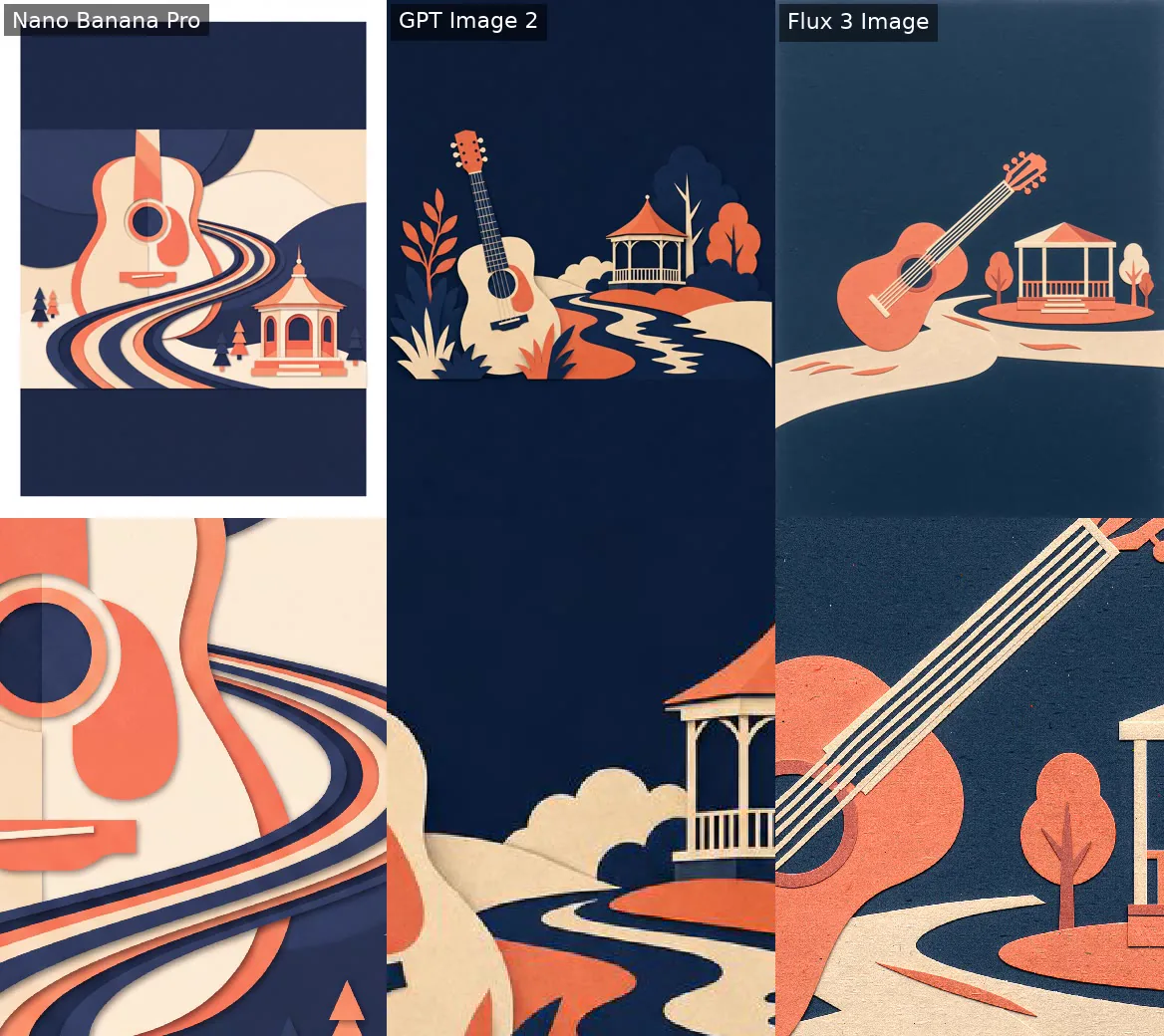
Artwork with reserved text areas: Nano Banana Pro · GPT Image 2 · Flux 3 Image. Test prompt. Bottom row: the same close-up of each, zoomed. Our test, Nov 17, 2026.
Choose that approach when the guitar and bandstand should form the central image. For a background intended for later assembly, change the composition instructions: request sparse river, sound-wave and foliage shapes along the side edges, leaving the center quiet. Explicitly exclude the guitar and bandstand so they can be placed separately.
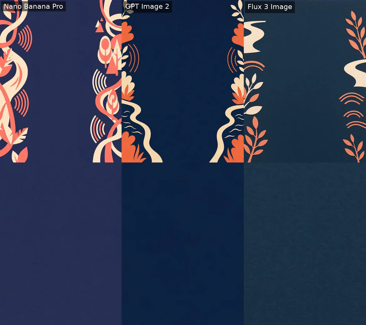
Backgrounds awaiting layout assembly: Nano Banana Pro · GPT Image 2 · Flux 3 Image. Test prompt. Bottom row: the same close-up of each, zoomed. Our test, Nov 17, 2026.
The distinction is practical. Reserved typography areas surround an existing illustration; a background leaves room for both the illustration and the lettering.
Should you generate the lettering or add it in an editor?
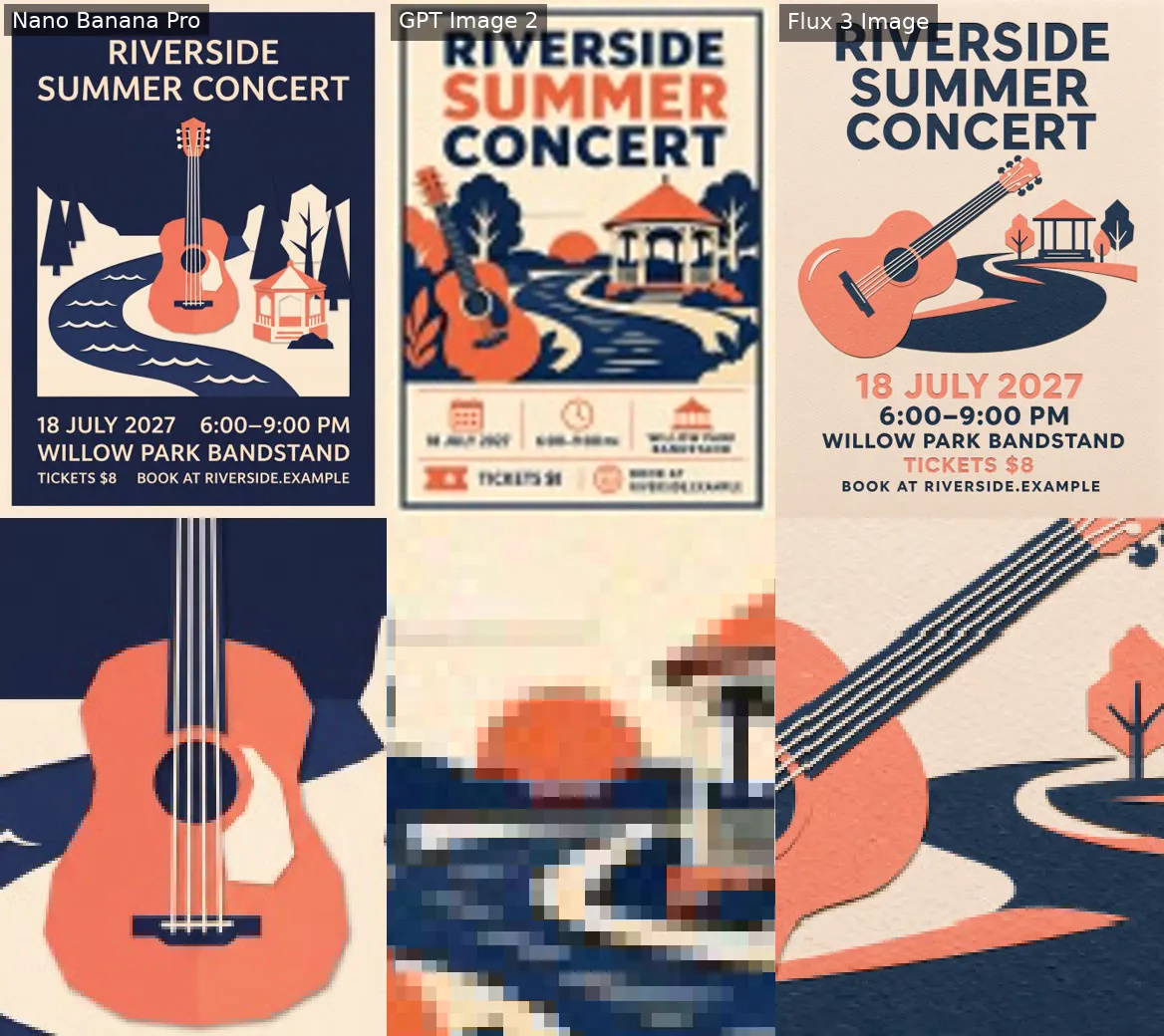
Use Nano Banana Pro for artwork, then add editable lettering in Adobe Express or Canva. Our blind AI review scored images without knowing the method. Nano Banana Pro and Flux 3 Image rendered every event phrase accurately; GPT Image 2 lost smaller text at 96 × 128 pixels. We tested a fictional concert with thumbnail checks, so these results cover that design only.
Editable text makes revisions straightforward. Change the venue, correct the booking address or update the time without regenerating an illustration you already like. Keep the event copy in the editor and use the generated image as the artwork layer.
Try Ultra HD Image Generator → Plans start at $19.99; credit packs from 350 credits.
The complete posters from Nano Banana Pro and Flux 3 Image also had clear hierarchy. Choose that route when every phrase matches your event copy exactly and you do not expect later text changes. Check the wording before accepting the image, even when the lettering looks convincing.
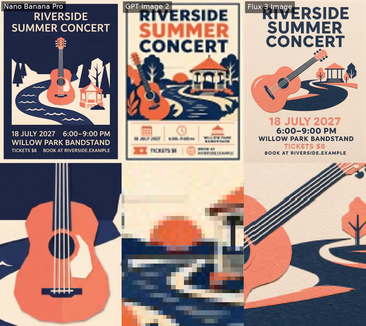
Complete posters at thumbnail scale: Nano Banana Pro · GPT Image 2 · Flux 3 Image. Test prompt. Bottom row: the same close-up of each, zoomed. Our test, Nov 17, 2026.
Nano Banana Pro produced 448 × 600 pixels in 53 seconds; Flux 3 Image produced 444 × 592 pixels in 109 seconds. That makes Nano Banana Pro our practical pick for the artwork stage.
| Method | Output size | Blind AI review (0-10) | Processing time | Credits |
|---|---|---|---|---|
| Nano Banana Pro (Thumbnail readability check) | 448×600 | 4.9 | 53 s | 20 |
| Flux 3 Image (Thumbnail readability check) | 444×592 | 4.8 | 109 s | 15 |
| GPT Image 2 (Thumbnail readability check) | 96×128 | 4.5 | 90 s | 25 |
The weaker supporting text from GPT Image 2 needs context: its tiny output left very few pixels for small letters. The result shows why image dimensions matter alongside the generator’s handling of typography.
How do you fix unreadable text or a crowded poster?
Fix readability by giving the event name the strongest emphasis, grouping the schedule and venue, and separating the booking instruction from decorative artwork. Replace garbled lettering with editable text. If the layout feels crowded, remove decoration before shrinking essential details. Use a quiet, contrasting area behind text and inspect a small preview.
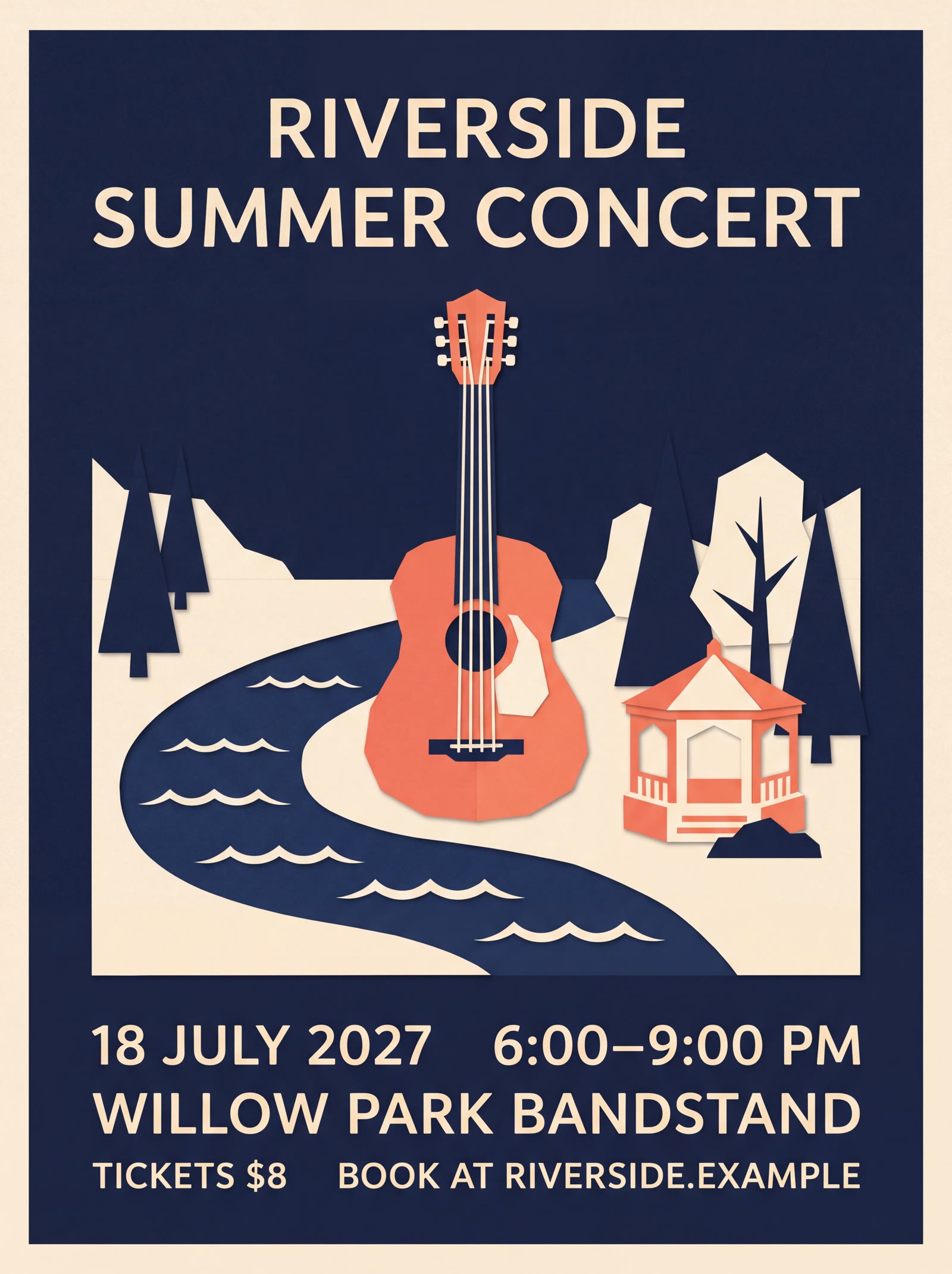
Make the concert title the largest text, then group the date, time and venue into a compact, clearly spaced block. Give the booking instruction its own breathing room. Warm cream lettering belongs on the quiet navy areas, away from the guitar and the pale river.
For damaged lettering, cover the affected area with a clean navy patch, then add editable type in your layout editor. If that patch would obscure the illustration, regenerate the artwork with a larger quiet area instead. Squeezing smaller text into the remaining gaps is the wrong trade-off.
Our artwork comparisons exposed space problems worth fixing: Nano Banana Pro introduced an unwanted white outer border, while Flux 3 Image let the river intrude into the lower typography area. Remove the border without clipping useful artwork, and reposition or simplify the river before adding supporting details.
Check the assembled poster as a thumbnail for hierarchy, then at full size for letter edges, spacing and collisions. The small preview should make the event name and booking instruction easy to find; the full-size view should make every supporting detail comfortable to read.
How do you adapt the poster for print and social media?
Make separate print and social layouts, repositioning artwork and editable text instead of stretching the finished poster. Adobe Express offers a Resize tool for different destinations. For print, use the intended paper size and 300 DPI image resolution, verify the required pixel dimensions, and check the exported file at actual size.
Keep the same illustration, palette and type hierarchy across both versions. Different aspect ratios need different arrangements: move the title, shift the artwork and reposition the booking details. Sacrifice expendable edge decoration before squeezing the content. Keep essential lettering comfortably inside each final crop rather than relying on the original image margins.
For the portrait print version, establish the physical page dimensions first. The page width and height, together with the target print resolution, determine the pixel width and height needed. Check both dimensions in the export settings; changing the resolution label alone does not add image detail.
Our tested source images need substantial enlargement for the intended print output. Enlargement alone cannot restore missing detail, so inspect the illustration’s crisp edges as well as the lettering.
Before approving the export, check the page size, final pixel dimensions, printer-required bleed and safe margins. Then print a physical proof at the intended size. Read the smallest supporting details and inspect the cream-on-navy contrast under ordinary lighting before ordering the full run.