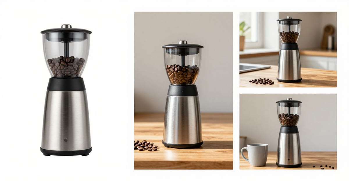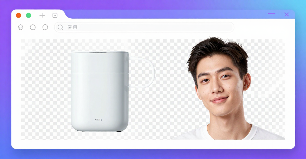
How do you replace a photo’s background with black?
Upload your image to our background changer, use Qwen Image 3.0 Pro (Edit), and request a black background while preserving the subject’s shape, texture, and lighting. The repeatable settings below cover subtly lit and solid treatments. For a conventional editor, ACD Systems’ Gemstone Photo Editor offers Black under Background Content. Choose that when you want direct background-color control.
Try Luxury Background Changer → Plans start at $19.99; credit packs from 350 credits.
After uploading, select the method and describe both the replacement background and what must stay unchanged. Keep the instruction focused on the background so the requested edit is easy to assess.
For a subtly lit dark background, use:
Replace the background with a near-black studio background with a subtle dark gray gradient. Preserve the subject’s shape, position, color, texture, fine edges, and existing lighting. Keep any contact shadow plausible and consistent with the subject’s lighting.
For a solid-black background, use:
Replace the background with uniform solid black. Preserve the subject’s shape, position, color, texture, fine edges, and existing lighting. Keep the background evenly black across the image.
Run the edit, then compare the result with the upload before accepting it. Use the subtly lit version as the starting choice; use the solid version when the finished image specifically requires uniform black. Keep the preservation instructions unchanged between attempts so you can compare the background treatments directly.
Which photos work best, and how should you prepare them?
Start with a sharp image whose subject has clearly visible boundaries. Adobe Express recommends clear edges with nothing overlapping. Choose the source with the best visible texture, leave space around loose hair and handles, and avoid cropping away details you want the replacement to retain.
For a product shot, choose the frame where the entire item is in focus, including projecting straps, spouts, and small hardware. A tidy composition is less useful if the handle merges into something behind it. If you have several shots, compare the subject itself before choosing the most attractive existing background. That background is about to go.
For a portrait, keep the outer hair shape and shoulders inside the frame. Leave breathing room around flyaways rather than trimming tightly to the head. Watch for objects crossing the subject’s outline, especially near hair and clothing.
Keep preparation restrained. Use the strongest original image available and postpone a tight final crop until after replacement. We would choose a slightly wider, sharper source over a tightly framed image with soft edges. The exception is when the wider shot makes the subject too small to show the detail you need.
Should you choose solid black or a subtly lit dark background?
Choose subtly lit dark for a studio look; solid black gives a uniform field. We would use Qwen Image 3.0 Pro with the subtly lit treatment for its gentler background transition. That run took 88 seconds; the Qwen Image 3.0 Pro (Edit) solid-black treatment took 50 seconds.
A dark gradient gives the finished image a sense of studio space. The background stays restrained, but its slight tonal variation makes the composition feel less like a cutout placed on a blank canvas. Choose uniform black when the finished image specifically needs an uninterrupted black field, such as a product series with a consistent background requirement. A subtly lit background will still contain visible gray tones.
The extra processing time bought the treatment we preferred here. Choose by the intended appearance first, then use the timings below to weigh the wait.
| Method | Output size | Blind AI review (0-10) | Processing time | Credits |
|---|---|---|---|---|
| Qwen Image 3.0 Pro (Edit) | 2048×2048 | — | 88 s | 20 |
| Nano Banana Edit | 2048×2048 | 6.1 | 20 s | 25 |
| Nano Banana Edit | 2048×2048 | — | 27 s | 25 |
| Qwen Image 3.0 Pro (Edit) | 2048×2048 | — | 50 s | 20 |
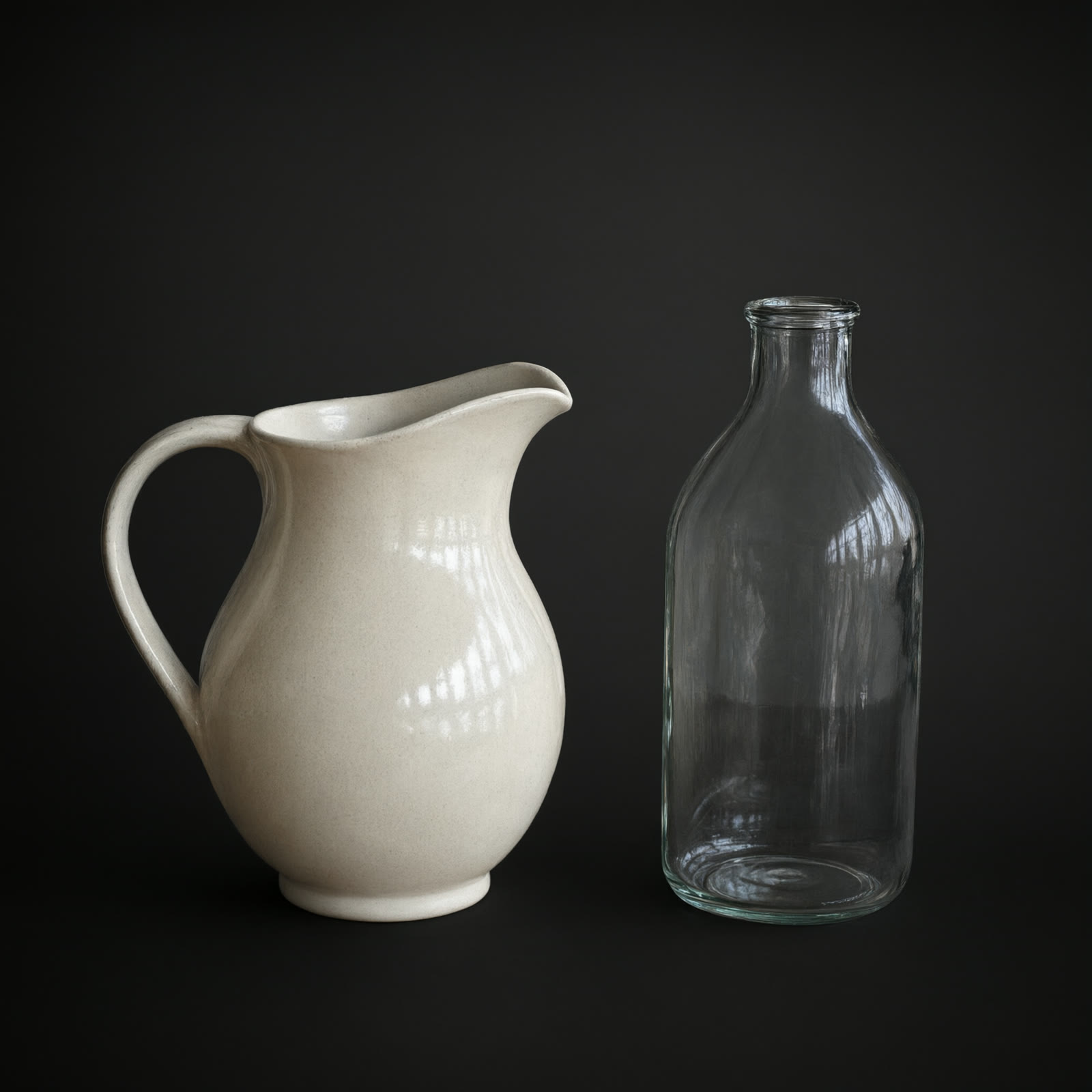
We compared solid-black and subtly lit replacements against the AI-generated still images used as inputs. A blind AI review scored each result against its input without knowing which method made it. Review passes used swapped order, and disputed judgments were excluded from the results.
These AI-generated test images support visual comparisons, but cannot establish performance across camera photos or every hair and fur texture. Use the comparison to choose the background treatment, then inspect the finished subject closely before publishing.
How well are hair, fur, glass, and reflective edges preserved?
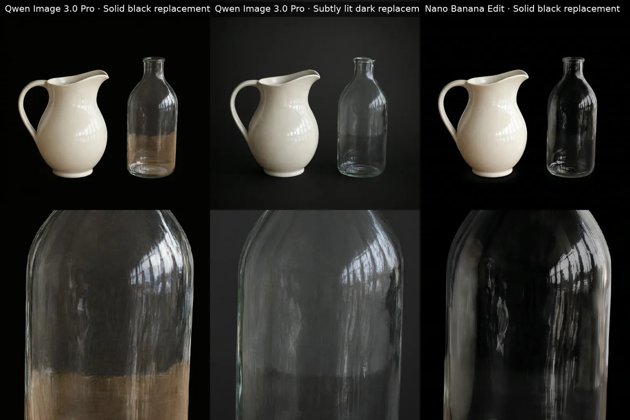
Glass transparency held up well in the recommended dark treatment, while fine surface details were less dependable in some alternatives. Nano Banana Edit slightly smoothed leather grain and clasp detail. Enlarge hair and fur crops to check individual strands, and compare reflective edges and glass interiors against the original before accepting an edit.
For transparent products, use Qwen Image 3.0 Pro with the subtly lit dark treatment. Its handling of glass transparency makes it our pick here. Look through the bottle as well as around it: the new background should remain visible through transparent areas without replacing the glass’s defining reflections.
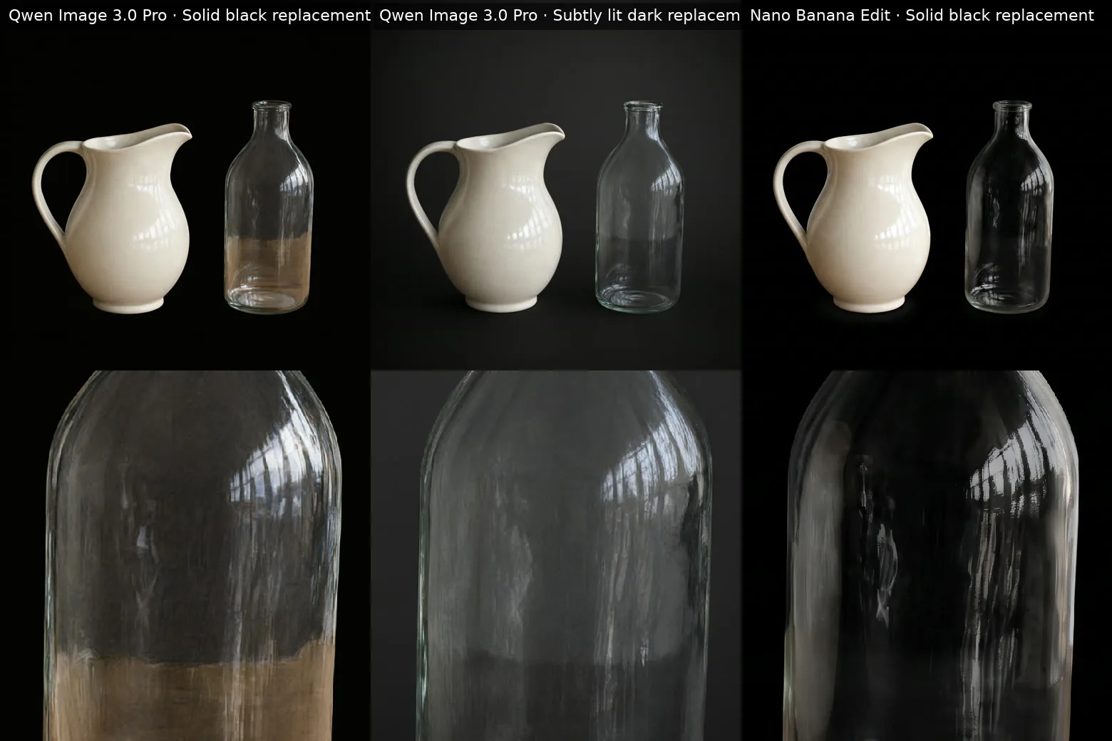
Light products, reflective edges, and transparent glass: Qwen Image 3.0 Pro · Solid black replacement · Qwen Image 3.0 Pro · Subtly lit dark replacement · Nano Banana Edit · Solid black replacement. AI-generated test image, made for this test, not a real photo. Bottom row: the same close-up of each, zoomed. Our test, Nov 2, 2026.
Reflective contours need a separate look. Follow the bottle’s bright rim and the ceramic pitcher’s glazed edge, comparing their shape and highlight placement with the original. A tidy outline can still hide altered detail. The slight smoothing in Nano Banana Edit is a reason to inspect textured surfaces and small metal parts closely, even when the overall separation looks convincing.
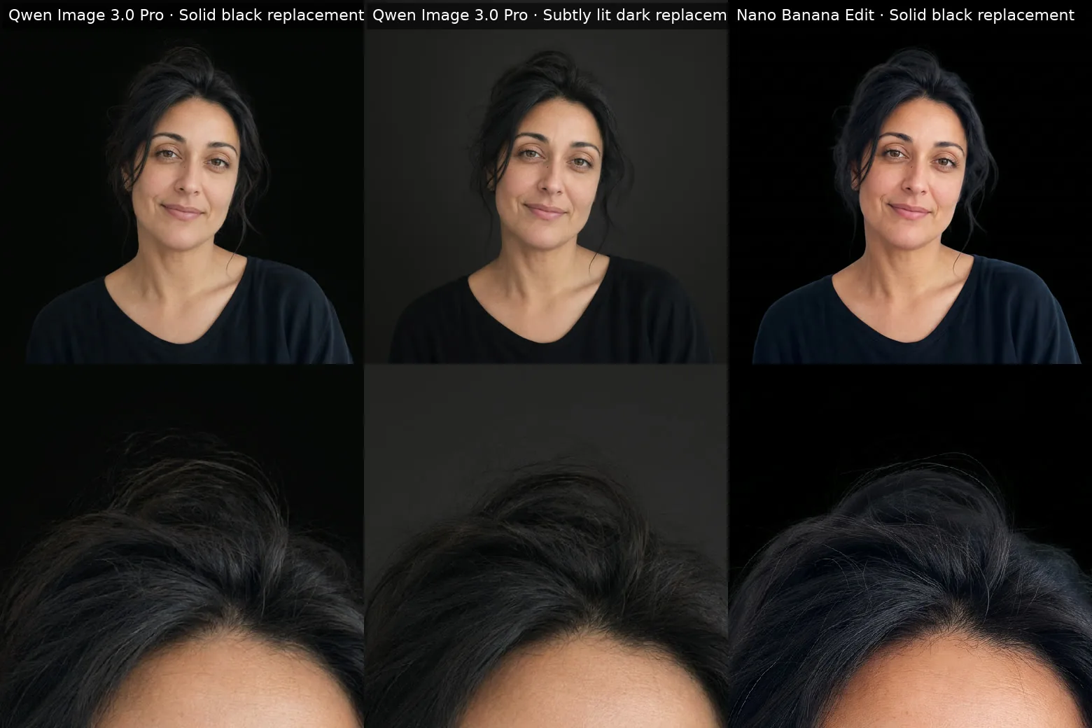
Flyaway hair against solid and subtly lit backgrounds: Qwen Image 3.0 Pro · Solid black replacement · Qwen Image 3.0 Pro · Subtly lit dark replacement · Nano Banana Edit · Solid black replacement. AI-generated test image, made for this test, not a real photo. Bottom row: the same close-up of each, zoomed. Our test, Nov 2, 2026.
For hair, enlarge the same patch in the original and edited versions. Follow loose strands beyond the main silhouette, then check the gaps between them. Use the same approach for fur: inspect individual tufts and the spaces around them. Keep the version that preserves those irregular boundaries rather than turning them into a soft, continuous fringe.
How do you keep a black subject visible against black?
A gentle dark-gray gradient keeps a black subject readable without changing its lighting. Our handbag result with Qwen Image 3.0 Pro retained a clear outline and visible pebble-grain texture. Request a subtly lit background while keeping the subject’s existing highlights. Reserve uniform black for images whose original edge lighting already defines the silhouette.
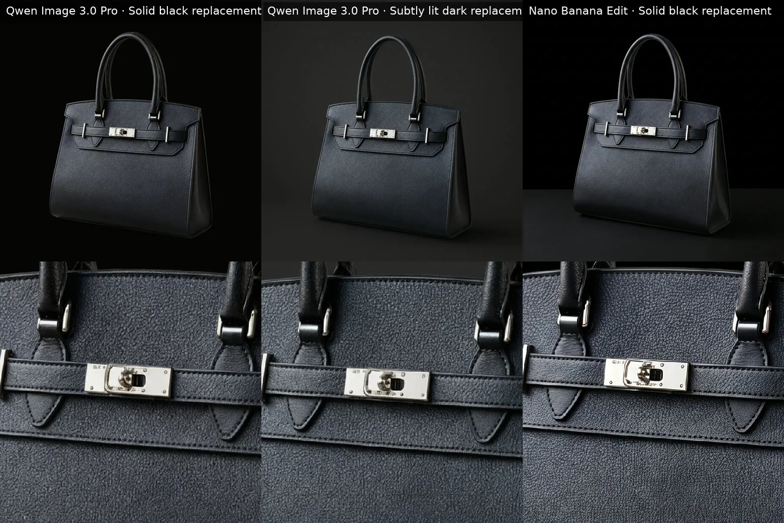
Keeping a black handbag distinct without relighting: Qwen Image 3.0 Pro · Solid black replacement · Qwen Image 3.0 Pro · Subtly lit dark replacement · Nano Banana Edit · Solid black replacement. AI-generated test image, made for this test, not a real photo. Bottom row: the same close-up of each, zoomed. Our test, Nov 2, 2026.
Look at the handbag’s darkest contours in the comparison, especially where the handle and sides meet the background. Those boundaries need enough tonal contrast to remain readable. A bright clasp can draw attention, but it cannot define the shape of the whole bag.
We would keep the bag’s lighting intact and put the separation into the background. Ask for a restrained dark-gray gradient behind the subject, with the existing highlights and dark surface tones preserved. Asking to brighten the entire bag risks losing the deep-black appearance you wanted to photograph in the first place.
Judge the result at its intended publishing size. If the handle opening or side contour disappears in a small product thumbnail, the background needs more separation there. If the original image already has a clear highlight tracing those edges, uniform black is a workable choice. Keep that highlight rather than requesting additional subject lighting.
What should you check for halos, leftovers, and unnatural shadows?
Check pale rims, retained background fragments, and contact shadows before approving the edit. Our Qwen Image 3.0 Pro solid result left brown table content inside the glass and made the handbag float. The Qwen Image 3.0 Pro dark result retained a faint table-edge line through the bottle. Nano Banana Edit left a grayish glow around the pitcher’s base.
Inspect the transparent interior as closely as the outer contour. The brown table remaining inside the solid-black bottle is a reason to reject that edit, even if its outline looks tidy. In the subtly lit result, the thinner table-edge remnant is easier to miss. Enlarge the bottle and follow any horizontal lines through it before approving.
A clean silhouette does not guarantee convincing contact with a surface. Look beneath the handbag: the solid-black result separated it cleanly, but missing grounding shadows made it appear suspended. For a product meant to sit on a surface, keep a plausible contact shadow close to its base.
Check the pitcher’s base for a pale fringe that looks brighter than the surrounding surface. The grayish glow in our result is the kind of defect that can disappear in a small preview and become obvious in a product listing.
We would rerun any edit with visible background remnants, edge glow, or missing grounding shadows. A tidy outline alone is not enough to publish.
How do you check export dimensions and image detail?
Check the downloaded file’s dimensions, then compare subject detail at matching display sizes. Our Qwen Image 3.0 Pro output measured 2048 pixels wide by 2048 pixels high. Larger dimensions alone do not prove finer detail; inspect lettering, texture, and small hardware before publishing the final image.
Use the saved file for this check, rather than judging only the editor preview. FFmpeg can inspect its dimensions. Confirm that the width and height suit your intended placement, then open the original and edited versions side by side.
Match their displayed size first. Comparing both at the same zoom percentage can be misleading when their pixel dimensions differ: the larger file displays the subject bigger. Look at the same patch of material or the same piece of hardware in each version. Does lettering retain its shape? Are tiny fasteners still distinct? Does texture contain recognizable detail, or merely look smoother?
We would choose the export that preserves those details over one that simply has more pixels. Finally, preview the image at its intended publishing size. That catches a different problem: detail that survives close inspection but becomes unreadable in the finished listing or portrait layout.